

Ineficient Lead Sharing
Users were spending too much time sharing lead data with eachother.
E2open's solution suites provide visibility and collaboration across every supply chain touchpoint—spanning planning, supply, global trade, logistics, and channel management.
With a compact design team of eight, we handled design across these diverse verticals. This project highlights my work on Channel, specifically in Channel Marketing Automation.
Users were spending too much time sharing lead data with eachother.

Admins had to individually work with each partner to consolidate and maintain the product’s lead repository.
Making it easier for users to browse through lead details, share them quickly, and handle different tasks more efficiently.
After a task analysis, I found that the user needed to navigate to a different page to access each these tasks that were all related to the same data and often interconnected.


Comfort with Excel encourages reliance on grid-based interfaces, which can limit visual hierarchy and make it harder to quickly scan for key lead information, something a more visual layout could improve.

Each partner formatted their lead data differently, leading to inconsistent structures that made it difficult for managers to review files and added confusion when sharing information across teams.
Ideation
Grids aren’t ideal for representing hierarchical data, so I explored a card-based layout that better supports information organization by hierarchy. I experimented with different column layouts to evaluate the trade-off between information density and scannability.
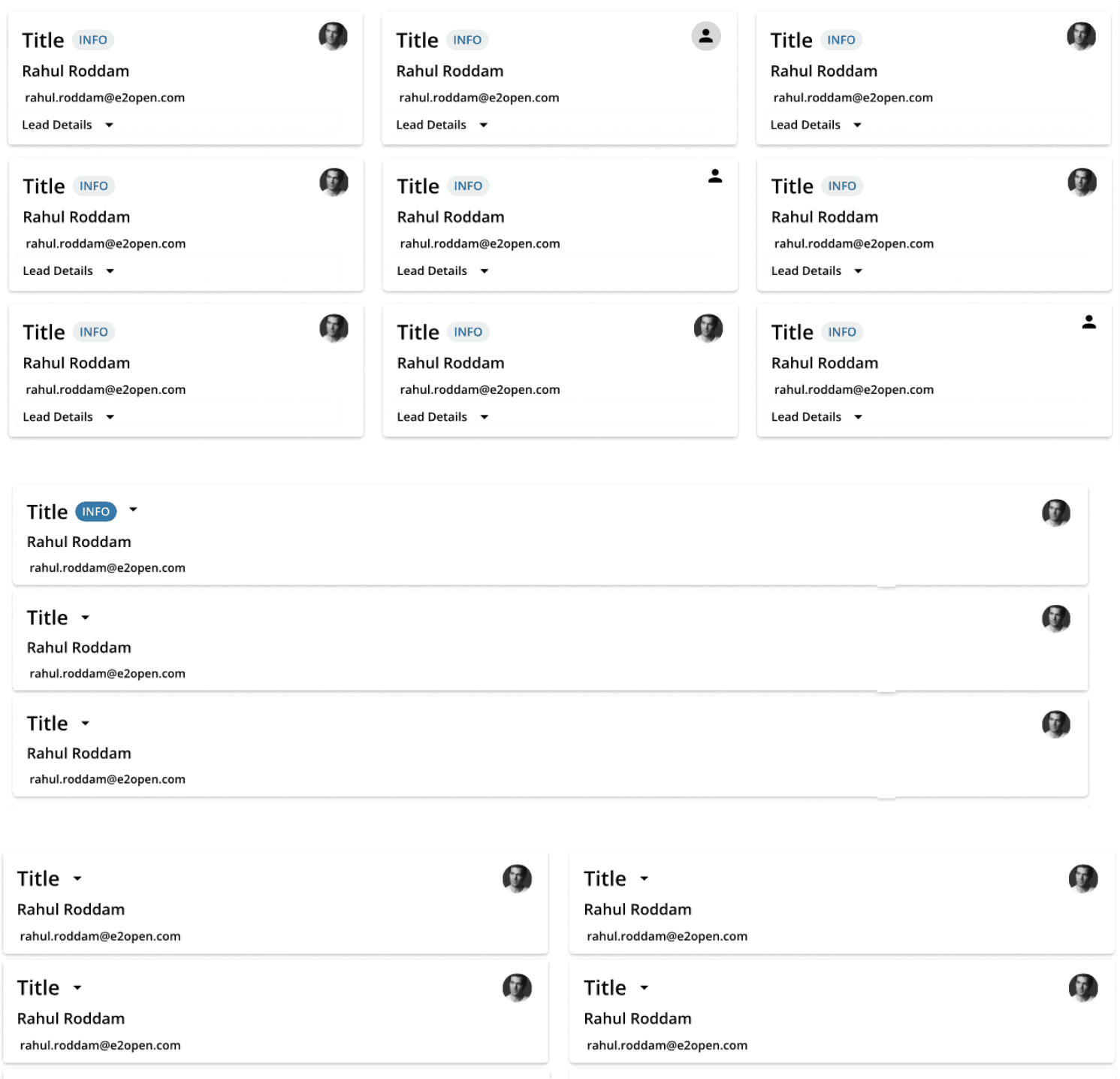
The team didn’t have the time or resources to implement a brand-new card layout, I suggested a phased design update as a stopgap.
Focused on consolidating the existing grid system to streamline workflows and ease transition for users familiar with existing structures, I worked on a grid system that centralizes functionality for all user types, resolving the pain points of navigating multiple workflows and scattered pages.


Phase 2 of the design project focused on enhancing data presentation. I implemented changes to improve scannability, optimize information organization, and elevate the visual aesthetics, addressing user feedback regarding data accessibility.

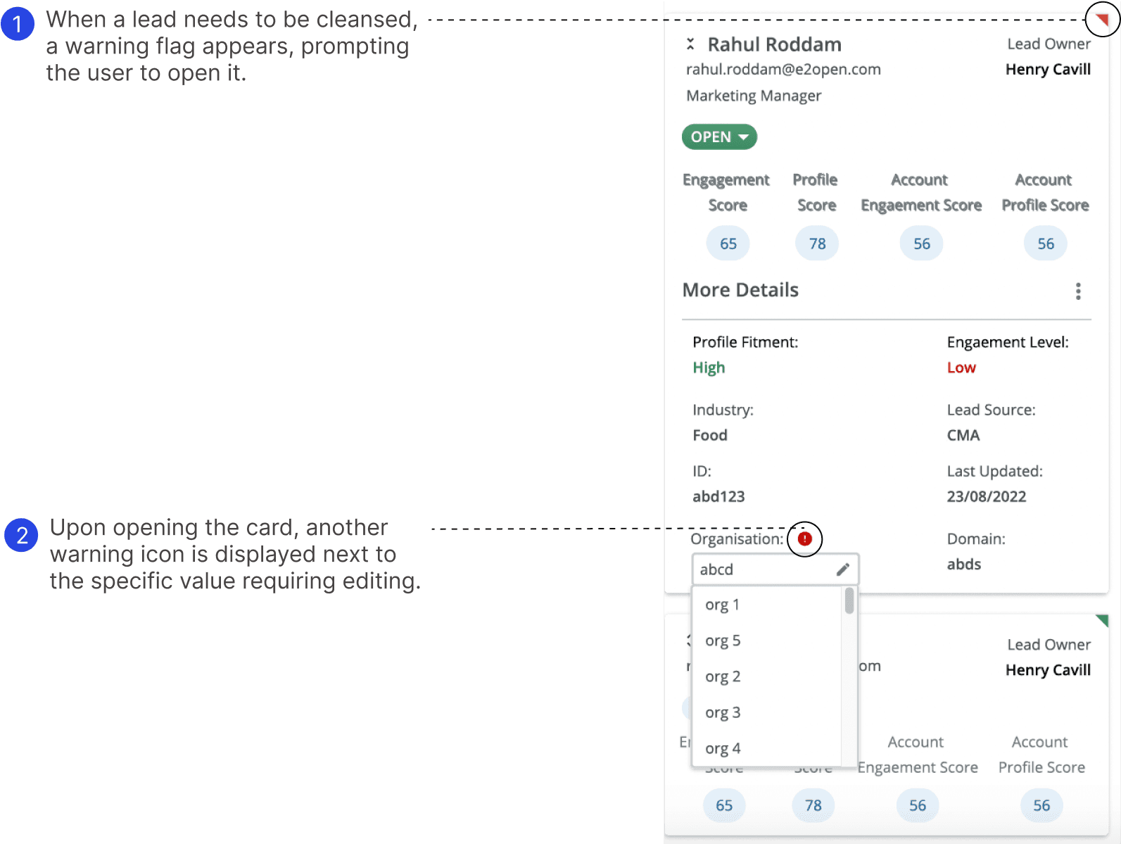
A single lead may contain inconsistent user-entered information; for example, a name might appear as 'Sahana Rao' in one instance and 'Sahana R' in another. Partners must then manually correct the lead to ensure accuracy.
Testing is in progress to evaluate the impact based on the following considerations
What percentage of users actively use the card view versus the traditional grid layout?
How much time has been reduced in cleansing a lead since implementing the redesigned experience?
Are users able to extract key information from collapsed cards, or do they frequently expand them to complete tasks?
What percentage of users leverage view customization to support collaborative vs. individual workflows?
Takeaways
I learnt how to budget time. This was a big undertaking for a smaller timeframe
I learnt how to come up with different ideas within an existing design system and framework
I learnt how to organize ideas by following process driven iteration
Regular communication with product stakeholders is a must

